Introduction to Color Psychology in Branding
Have you ever wondered why certain colors instantly evoke specific emotions or why particular brands become immediately recognisable simply through their signature color? Color psychology in marketing and branding is more than just selecting aesthetically pleasing hues—it’s a strategic approach to color psychology that significantly influences consumer behaviour, brand perception, and emotional connection.
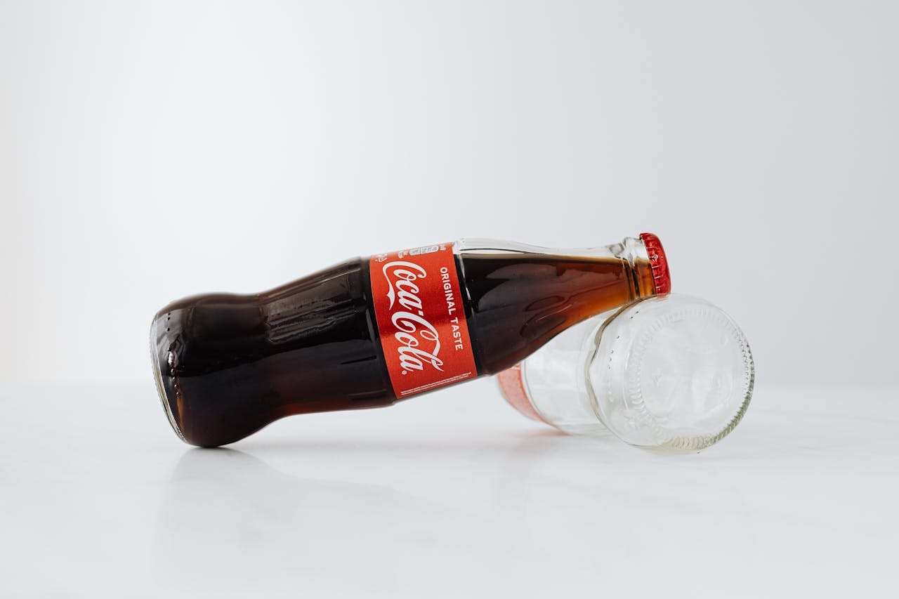
It’s the subtle yet powerful force behind memorable brand identities like Coca-Cola’s vibrant red or Facebook’s trustworthy blue.
Color psychology taps into human emotion and cognitive responses, creating subconscious associations that can deeply influence purchasing decisions, customer loyalty, and overall brand success. Understanding this psychological relationship between color psychology and consumer responses can dramatically improve the effectiveness of your brand communication and marketing strategies.
At Piri-Piri Marketing Hub, we recognise that choosing the correct color palette goes beyond mere decoration; it encapsulates your brand’s personality, ethos, and brand color psychology positioning in the marketplace. Selecting appropriate Colors can profoundly impact how your target audience perceives specific colours of your brand and interacts with your products or services.
A strategically crafted Color palette can differentiate your brand in a competitive market, establishing a compelling visual identity and forging lasting emotional connections.
Colors shape perceptions almost instantly. For instance, warm Colors and different shades like red and orange can create feelings of excitement and urgency, ideal for sales or promotional events. On the other hand, cool Colors such as blue and green project stability, reliability, and trustworthiness, making them popular choices among corporate and technology brands.
Luxury brands frequently choose rich, deep hues like purple or black to convey sophistication and exclusivity.
Moreover, effective use of Color psychology goes beyond initial branding—it extends to all customer touchpoints, from marketing materials and digital platforms to product packaging and even physical retail environments. Ensuring consistency and intentionality in your same colors choices throughout your entire customer journey reinforces brand recognition and loyalty, creating a cohesive and memorable customer experience.
In this comprehensive exploration, we’ll delve deeper into how Color psychology influences consumer perceptions and behaviour, practical methods for selecting the perfect Colors for your brand, common pitfalls to avoid, and successful real-world examples of Color psychology in action.
Whether you’re launching a new brand or revitalising an existing one, harnessing the power of Color psychology can significantly elevate your marketing efforts, enhance your brand image, and drive measurable business outcomes.
Our Branding Design Services includes a good analysis of the brand to give your organization or company that you represent.
What is Color Psychology?
Color psychology is the study of how different hues, tones, and color combinations affect human emotions, thoughts, and behaviours. At its core, it explores how visual stimuli—especially colors—trigger subconscious responses and influence the way people perceive brands, products, and environments.
This field bridges the gap between psychology and design, offering valuable insights into how brands can strategically use color to communicate their values, inspire action, and differentiate themselves in competitive markets.
In branding, color psychology plays a critical role in crafting the emotional tone and perceived personality of a business. It helps shape the visual language of a brand, guiding how customers feel when they encounter your logo, website, packaging, or marketing materials.
Each color has been found to evoke certain emotions and associations. For instance, red can stir passion or urgency, while blue often represents calm and trust.
Research shows that human beings make judgment calls about people and products within 90 seconds of initial interaction—and between 62% and 90% of that assessment is based on color alone. This makes color not just an aesthetic choice but a powerful marketing tool that influences how your brand is perceived, remembered, and its color associations with emotions.
Color can also influence purchasing decisions and increase brand recognition , enhance customer satisfaction, and build stronger brand loyalty.
From cultural context and psychological factors to personal preferences and design trends, numerous variables influence how color is interpreted. Understanding these nuances allows brands to use color more intentionally, delivering messages that resonate with their target audience using effective color patterns . When leveraged correctly, color psychology becomes a persuasive and powerful marketing strategy tool that reinforces brand identity and drives consumer engagement.
Why Color Matters in Branding
Choosing the right brand colors isn’t merely about visual attractiveness; it’s about strategically applying color theory to craft your visual language and brand identity to resonate deeply with your audience. Color is an essential element in establishing a brand’s emotional tone, influencing how customers feel when they encounter your marketing materials, social media platforms, packaging, or even your storefront.
Color has the ability to shape perception and build strong emotional connections with your target audience. For instance, colors can evoke specific emotions such as trust, excitement, calm, or energy—making them vital tools for communicating the essence of your brand personality.
The consistency of using the same colors across all marketing channels fosters familiarity and builds brand recognition over time.
Furthermore, studies show that color influences up to 90% of initial product assessments. When used effectively, color becomes more than just a visual aid—it functions as a silent brand ambassador that strengthens your messaging and inspires loyalty. Whether it’s the signature colour red logo of Coca-Cola that evokes excitement, or the calming blue tones of a banking institution that promote trust, colors convey more than meets the eye.
In a saturated marketplace, your choice of color can also serve as a differentiator. A bold or unconventional color palette can make your brand stand out from competitors, helping consumers remember your offering long after their first interaction. This is especially critical for emerging businesses looking to establish a strong visual presence quickly.
Finally, brand color psychology is not only about evoking emotional responses—it also plays a strategic role in influencing human behavior. From sale signs in red that create urgency to luxury packaging in deep purple that suggests premium quality, the impact of color preferences on consumer decision-making cannot be overstated, as it directly affects your brand’s success . Used thoughtfully, color becomes a powerful component of your overall brand strategy.
Understanding the Color Spectrum: Emotional Associations
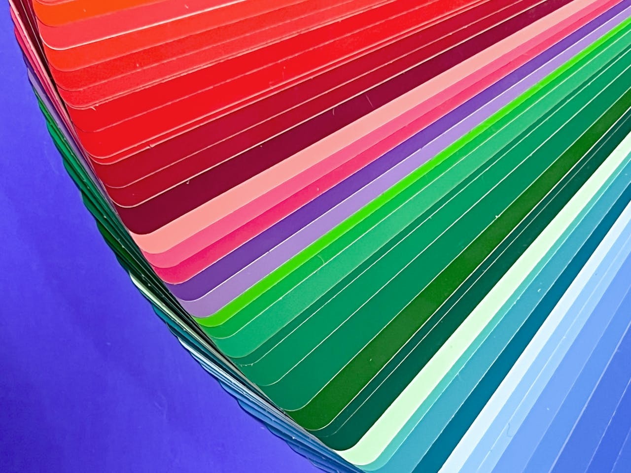
Color is more than just a visual experience—it’s a psychological trigger. When used with intention, the color spectrum becomes a sophisticated tool for shaping how consumers feel about your brand. From the very first glance, colors evoke specific emotions, influence thought color patterns, and drive behavioral responses that align with your brand’s objectives.
Whether you’re designing a logo, building a website, or creating a product package, the colors you select are quietly telling your brand story.
These hues are rooted in human experiences, cultural narratives, and emotional symbolism that transcend generations. Understanding these emotional associations empowers brands when using the color wheel to build lasting trust, enhance brand recognition, portray the right message, and form deep emotional bonds with their audience.
Each color within the color spectrum holds distinct associations:
Red: Passion and Urgency
The classic red logo, such as Coca Cola, evokes excitement, urgency, and passion, often seen on sale signs and used by fast food chains.
Blue: Trust and Stability
Brands that incorporate color blue logos, like Facebook, leverage blue tones to project trust, reliability, and professionalism—vital for a strong brand identity.
Yellow: Optimism and Energy
Yellow is warm and vibrant, often associated with positivity and youthful energy, effectively used by brands targeting a lively target audience.
Green: Harmony and Natural World
Green symbolises health, tranquility, and the natural world, evoke emotions, making it popular among eco-friendly and wellness-oriented brands.
Purple: Luxury and Creativity
The deep purple hue is synonymous with premium quality and creativity, commonly seen among luxury brands.
Black and White: Simplicity and Elegance
These colours evoke sophistication and clarity, popular among high end brands and tech companies.
Cultural Differences in Color Preferences
Colors carry different meanings and emotional weight across global cultures. A color that inspires joy and celebration in one culture might evoke sorrow or even danger in another. These varying interpretations make it crucial for brands operating in international or multicultural markets to be highly mindful of the color associations specific to their specific colours audiences.
For example, while white symbolizes purity and innocence in Western societies—frequently used in weddings and wellness branding—it is commonly associated with mourning and funerals in many parts of Asia. Similarly, red may represent luck and prosperity in China but signal danger or urgency in Western contexts.
Blue, a color commonly associated with trust and dependability in Western nations, may not hold the same connotation in all regions. Green is linked to nature and peace in many parts of the world but may have religious or political implications in others. Even millennial pink, popular among Western millennials for its soft and contemporary tone, may not translate effectively in markets where pink is culturally reserved for specific genders or age groups.
These cultural differences affect not just brand perception but also consumer engagement. A color palette that fails to consider cultural relevance could unintentionally alienate a target audience or convey the wrong message entirely. Brands looking to expand globally or serve diverse audiences must research cultural color psychology to ensure they align their visuals with regional expectations and sensitivities.
At Piri-Piri Marketing Hub, we help brands navigate these complex waters, integrating cultural context into color selection to ensure global relevance while staying true to core brand values. This culturally intelligent approach helps your brand connect with a broader audience and become instantly recognisable without losing clarity or authenticity.
How Color Influences Consumer Behaviour
Research indicates up to 90% of consumers perceive brands initially through colors alone (Help Scout, 2023). Color is often the first thing a customer notices—and the emotion it triggers can determine whether they engage or move on.
This emotional impact is grounded in psychological responses shaped by biology, culture, and personal experience. For instance, red stimulates a sense of urgency and appetite, which is why it’s frequently used in fast food chains and clearance sales.
Color doesn’t just influence awareness—it also affects action. Studies have shown that strategic use of color in call-to-action buttons, landing pages, or sale signs can increase conversion rates. Blue, for example, tends to foster feelings of security and calm, making it a popular choice for finance, healthcare, and tech sectors aiming to reduce consumer anxiety.
Even subtle variations like saturation and hue can change how a color is perceived. A bold, saturated orange may energise a viewer, while bold colors and a muted pastel might soothe. Brands that align their color palette with their target audience’s expectations are more likely to influence purchasing decisions, retain attention, and increase brand loyalty.
Furthermore, color can guide consumer behavior through the buyer journey—from awareness to decision-making. A well-chosen palette can signal trustworthiness, sophistication, or innovation, helping reinforce the brand’s image in every interaction. For example, warm colors like orange and red can inspire impulse buys, while cool colors like green and blue are more effective for long-term relationship building and fostering trust.
Ultimately, color is a foundational part of how consumers perceive and interact with your brand. Used with intention, it can subtly guide their emotions, behaviours, and choices in ways that lead to stronger connections and improved business outcomes.
Steps to Selecting the Right Brand Colors
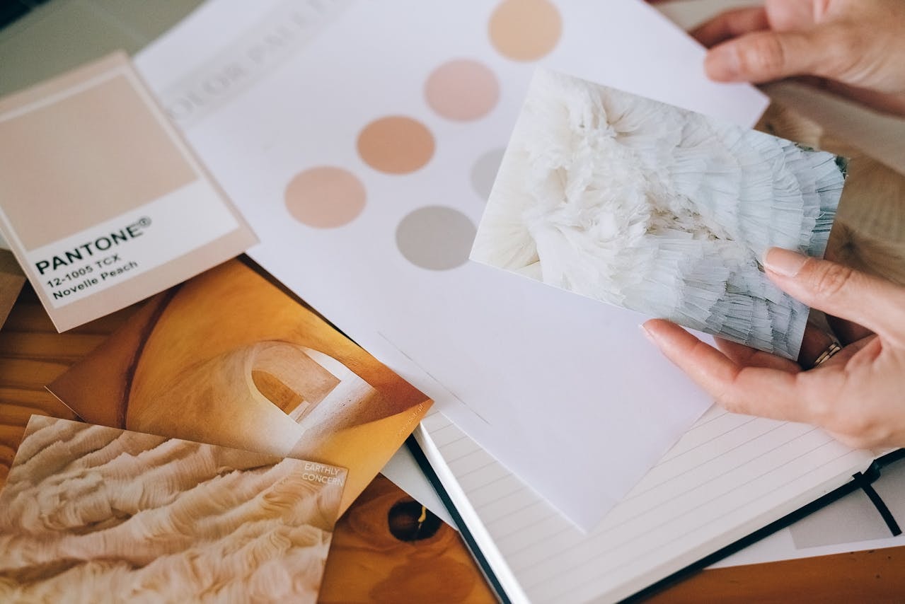
Creating a strong brand identity involves carefully considering several key factors. Choosing the right Color palette isn’t about personal preference—it’s a strategic decision rooted in your business objectives, customer expectations, and psychological factors that guide human behavior. The following steps help ensure your brand’s Color choices are purposeful, meaningful, and impactful.
Align with Brand Personality
Your brand personality is the heart of your visual communication. Is your brand fun and playful? Bold colors like vibrant orange or red may express that energy. Is it elegant and professional? Then cool colors like navy blue or charcoal might better reflect your tone. The goal is to let your Color palette communicate your brand’s traits even before a single word is read. A consistent tone across all branding and marketing materials solidifies your identity in the minds of your audience.
Understand Your Target Audience
Different age groups, cultures, and consumer segments respond uniquely to Color. While millennial pink appeals to a younger, trend-savvy demographic, more muted or classic tones may resonate with mature or professional audiences. Think about who your product or service is for—what are their preferences, values, and lifestyles? Matching your Color scheme to your audience’s expectations helps evoke emotions that build trust, encourage conversions, and reinforce loyalty.
Analyse Competitors
Competitor analysis doesn’t mean copying—it means identifying opportunities to stand out. Look at your competitors’ Color palettes and spot the gaps. If most players in your industry use blue tones, consider introducing a contrasting Color to create visual distinction. A strategic deviation from the norm can make your brand more memorable while still fitting within the acceptable aesthetic standards of your niche.
Color Combinations and Marketing Materials
Using complementary colors effectively across your marketing materials reinforces brand consistency and evokes intended emotional responses. These combinations are more than stylistic decisions—they help guide the viewer’s eye, emphasize hierarchy, and convey your message more powerfully.
A cohesive color scheme across your website, brochures, packaging, and social media creates a strong brand impression that lasts.
For instance, pairing bold primary colors with subtle neutrals can create contrast and make headlines or calls to action stand out. Complementary colors—those opposite each other on the color wheel, like blue and orange—naturally draw attention and are especially useful in designs where you want key information to pop.
Accent colors are another powerful tool. These are used sparingly to highlight specific elements such as buttons, links, or important features. When chosen carefully, the right palette and accent colors guide the user’s attention exactly where you want it and support the overall balance and mood of your materials.
Consider also the emotional tone of your combinations. Warm color pairings like red and gold create a sense of urgency and luxury, while cool combinations such as teal and grey evoke calm and sophistication. The right palette not only complements your brand identity—it also enhances user experience and drives engagement through psychological triggers.
At Piri-Piri Marketing Hub, we help you create marketing materials that are both visually stunning and strategically aligned. Whether it’s selecting the right base tones or refining how colors interact within your layout, our expert team ensures every piece of content supports your broader brand goals.
Real-world Applications of Color Psychology in Branding
Coca Cola’s Iconic Red
Coca Cola’s use of primary color red, their signature colour, is a textbook example of effectively using color to evoke specific emotions such as excitement and passion, helping it increase brand recognition recognisable globally.
Social Media Platforms and Blue Logos
Social media platforms often incorporate blue to build trust and reliability—crucial elements for online engagement and user confidence.
Premium Brands and Color Purple
Luxury brands frequently leverage the Color purple, as noted in the color psychology chart, to denote exclusivity, sophistication, and premium quality.
Common Color Mistakes in Branding
Ignoring Cultural Context
Not accounting for distinct associations different cultures have with certain colors can damage a brand’s reputation globally.
Overcomplicating Color Schemes
Using too many colours dilutes the clarity of your brand identity, confusing consumers.
Essential Tools for Color Selection
Leveraging tools like the Adobe Color Wheel or Canva’s Color Palette Generator simplifies selecting the ideal Color combinations for your brand.
Color Psychology Accessibility: Including Everyone
About 4.5% of Australians experience Color blindness, making inclusive Color choices essential. Accessible palettes ensure your brand’s message reaches everyone.
Color Myths Debunked
Myth: Universal Color Meanings
Colour psychology meanings vary significantly by personal preferences and cultural context, Proving that no Color has a universally fixed meaning in colour psychology.
Myth: More Colours Mean More Impact
Simplified and cohesive Color palettes strengthen brand recognition more effectively than overly complex ones.
Color Psychology Chart: A Quick-Reference Guide
To make colour psychology even more accessible, here’s a simplified chart that highlights how specific colors are commonly interpreted and used across branding and marketing. While these associations may vary based on cultural context and industry, they serve as a helpful guide for building your brand identity:
| Color | Emotional Association | Common Brand Usage |
|---|---|---|
| Red | Passion, urgency, excitement | Fast food chains, clearance sales, entertainment |
| Blue | Trust, reliability, calm | Finance, healthcare, tech, social media |
| Yellow | Optimism, energy, warmth | Retail, youth-focused products, hospitality |
| Green | Health, sustainability, nature | Organic brands, wellness, environmental causes |
| Purple | Luxury, creativity, mystery | Premium brands, beauty, education |
| Orange | Enthusiasm, affordability, friendliness | Sales promotions, e-commerce, lifestyle brands |
| Black | Sophistication, power, exclusivity | Luxury goods, fashion, technology |
| White | Simplicity, purity, cleanliness | Healthcare, minimalism, high-end design |
| Pink | Femininity, compassion, trendiness | Beauty, fashion, millennial audiences |
| Brown | Earthiness, stability, ruggedness | Agriculture, outdoor goods, heritage brands |
| Grey | Balance, neutrality, professionalism | Corporate brands, tech, consulting |
This color psychology chart is a powerful tool for aligning your color palette with your brand personality and audience expectations. It’s especially useful during the initial brand development phase or when evaluating a rebrand.
How Piri-Piri Marketing Hub Enhances Your Brand Color Psychology
At Piri-Piri Marketing Hub, we specialise in harnessing brand color psychology to craft compelling, high-impact brand experiences. Our approach begins with a deep dive into your brand’s core values, target audience preferences, and industry-specific positioning, including insights from the color wheel . We don’t just pick colors—we strategically align them with your brand’s story, tone, and objectives to become instantly recognisable globally.
Our expert team leverages proven color psychology principles and cutting-edge design tools to develop customized color palettes that evoke the right emotions and support a strong brand identity. Whether you’re launching a new business, undergoing a rebrand, or simply refreshing your marketing materials, we guide you through every step of the visual development process.
We also ensure consistency across all branding touchpoints—from your website and digital ads to your social media content, packaging, and printed collateral. This consistency amplifies brand recognition and reinforces trust, helping your audience build a lasting emotional connection with your business.
And because we understand that every brand is unique, our team offers tailored consulting services that include competitor color analysis, cultural and demographic alignment, accessibility reviews (including for color blindness), and integration into broader brand strategies.
By working with Piri-Piri Marketing Hub, you’re not just choosing a design service—you’re investing in a collaborative creative partnership that turns color into one of your most valuable strategic assets.
Conclusion: Color Theory as Your Competitive Edge
Incorporating Color psychology effectively into your brand strategy doesn’t just make your brand visually appealing—it makes it unforgettable. With the right knowledge of primary color theory , tools, and strategic application, color becomes one of your most powerful assets.
Ready to elevate your branding with expertly chosen colours? Connect with Piri-Piri Marketing Hub today, and let’s bring your brand to vibrant life.
